Offering the best Agri content through Farming experience.
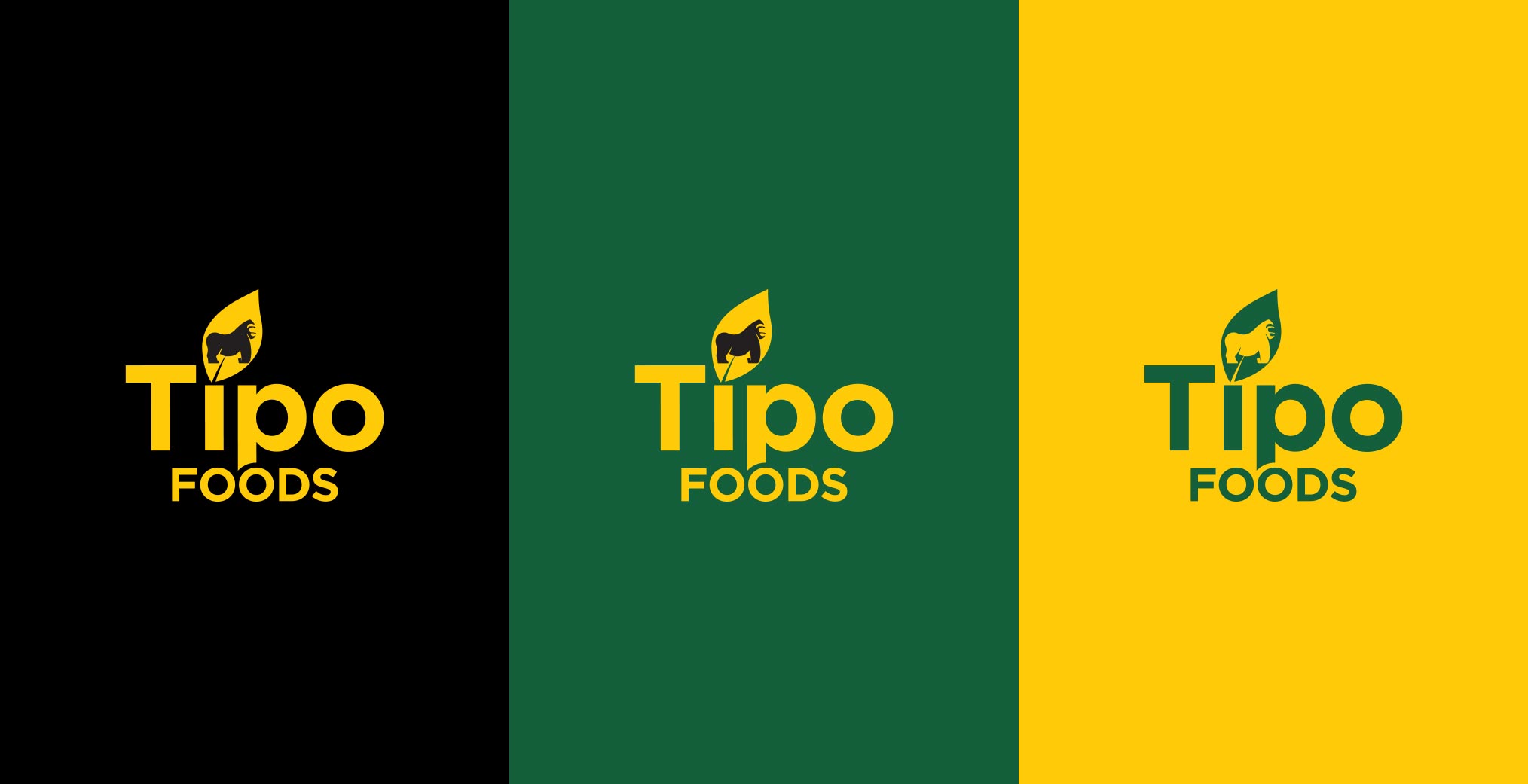
We engaged with the client in creating a distinct logo with an essential symbol that evokes the objective behind Tipo Foods.
With an aim of creating a connection with the audience, the selected colour palette was aligned to Agriculture.
Objective:
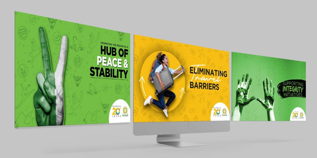
With an idea in mind, the logo construct had to be distinct in order to leave a memorable impression. The colours needed to complement the logo in order to adopt a relevant look and feel for the brand. The key communication executions revolved around digital layouts/ads.